

A poster that fails to convert isn’t just a design oversight; it’s a significant drain on your marketing budget in a city that never stops for a second glance. Mastering the core elements for posters is the only way to ensure your vision translates from the screen to high-resolution paper without expensive errors. You’ve likely felt the mounting pressure of a tight London deadline, worrying if your technical settings like bleed and DPI are correct or if your final print will look amateurish. It’s a common frustration for busy professionals who need their retail or corporate displays to work perfectly the first time.
This guide provides the technical and visual framework you need to create high-impact assets that capture attention in 2026. While a recent Adobe survey found that 75% of creators now integrate AI into their workflows, the success of your project still relies on fundamental design principles and precise production standards. You’ll learn how to utilize trends like the Pantone 2026 Color of the Year, Cloud Dancer, while preparing files that are ready for large-format printing. We will walk through a clear checklist of design elements and technical requirements to give you total confidence in your next print run.
Key Takeaways
- Master the fundamental visual elements for posters, including high-impact typography and strategic color contrast to ensure legibility from a distance.
- Learn to guide viewer attention using a clear visual hierarchy that prioritizes your most critical information in busy corporate or retail environments.
- Discover how to drive measurable engagement by crafting direct calls to action and integrating QR codes to bridge the physical-to-digital gap.
- Gain technical confidence in preparing print-ready files by understanding essential specifications like bleed, crop marks, and optimal paper weights.
- Explore industry-specific applications for retail and event displays, including the benefits of professional mounting for a polished, corporate finish.
The Core Visual Elements for Posters: Typography and Color
The visual impact of a retail display depends on how well you balance technical precision with creative intent. When selecting the foundational elements for posters, your choices in typography and color determine whether a passerby engages with your message or ignores it entirely. High-stakes retail environments in London require designs that communicate instantly, leaving no room for ambiguity or technical errors that appear once the file hits the printer. Your goal is to create a silent but vital engine for your brand’s physical presence.
Mastering Typography for Distance
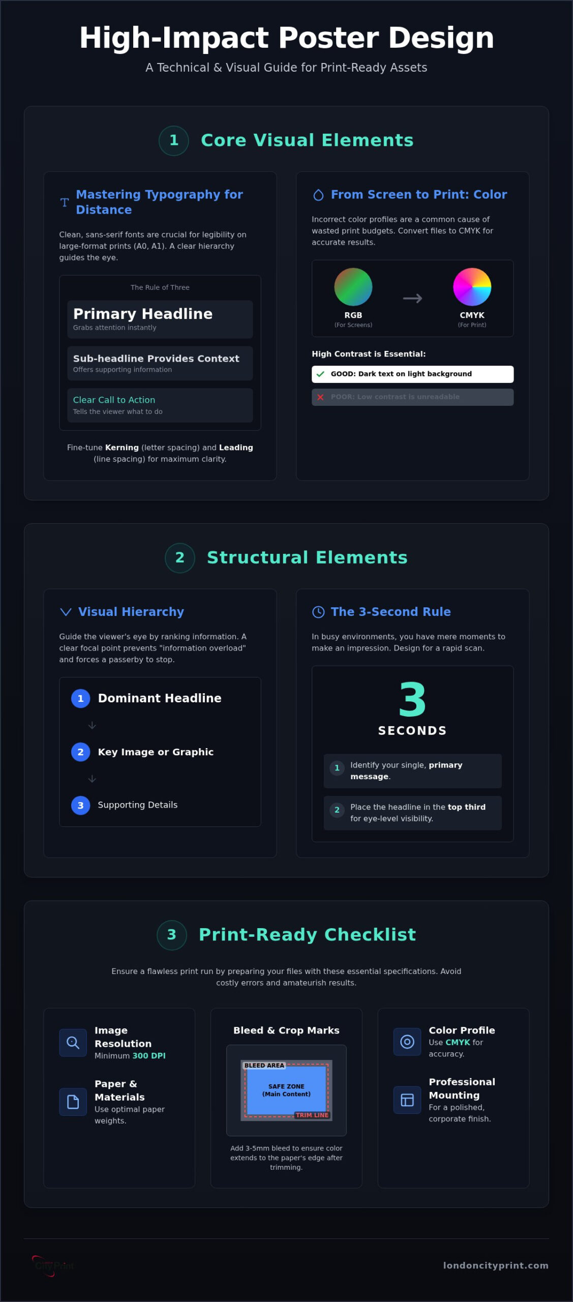
Large-format displays require a specific approach to font selection that differs from digital or standard document design. Sans-serif fonts generally dominate the landscape for A0 and A1 posters because their clean lines remain legible from several meters away. While serif fonts can convey a sense of traditional elegance, they often blur at distance, especially under the harsh lighting typical of corporate lobbies or retail floors. You should adhere to a strict hierarchy, often called the rule of three: a primary headline to grab attention, a sub-headline to provide context, and a clear call to action.
Technical adjustments like kerning, the space between individual letters, and leading, the space between lines of text, are vital for large-scale clarity. If your letters are too close, they’ll bleed together visually when viewed from a distance. Increasing the leading ensures that your sub-text doesn’t become a dense, unreadable block. These small refinements separate professional corporate assets from amateur attempts that waste your print budget.
Color Profiles: Moving from Screen to Print
One of the most common causes of wasted print budgets is a misunderstanding of color profiles. Most design work happens in the RGB (Red, Green, Blue) space, which is optimized for light-emitting screens. However, physical printing uses a subtractive process. CMYK is the industry standard for commercial printing because it uses Cyan, Magenta, Yellow, and Key (Black) inks to reproduce a wide spectrum of colors accurately on physical substrates. Failing to convert your elements for posters into CMYK before submission often results in dull, muddy colors that don’t match your brand’s digital identity.
High-contrast combinations are essential for retail visibility. Using dark text on a light background or bright accents against deep tones ensures your message pops in crowded spaces. For those using the 2026 Pantone Color of the Year, Cloud Dancer, contrast becomes even more critical. Since this is a billowy white shade, you’ll need bold, dark typography or vibrant imagery to ensure the layout doesn’t appear washed out under bright retail spotlights. All imagery must be at least 300 DPI to prevent pixelation on large-format prints like foam board posters or window graphics. If you are also interested in maintaining this level of print quality for your product packaging, you can learn more about DuraFast Label Company and their in-house labeling solutions.
Structural Elements: Hierarchy, Balance, and White Space
Structure is the invisible architecture that dictates how a viewer processes your information. Without a defined arrangement, even the most vibrant elements for posters will fail to communicate effectively in a high-pressure environment. In a city as visually saturated as London, your design must compete with thousands of other stimuli. Success depends on a clear focal point; a single, dominant element that forces a passerby to stop. This is often a large, high-contrast image or a bold headline that anchors the entire composition and provides a clear entry point for the eye.
Visual hierarchy is the tool you use to rank information by importance. By manipulating size, color, and placement, you tell the viewer exactly where to look first, second, and last. This prevents “information overload,” a common mistake that leads to potential customers walking away because the message felt too complex to digest quickly. Effective posters don’t just present data; they lead the viewer on a structured journey toward a specific conclusion.
Designing for the 3-Second Rule
In retail and corporate settings, you often have less than three seconds to make an impression. This rapid communication requires a disciplined approach to layout:
- Step 1: Identify your primary offer or message. Every other element must support this single goal.
- Step 2: Place your main headline in the top third of the page. This aligns with natural eye-level scanning patterns in public spaces.
- Step 3: Use font size and weight to differentiate secondary details like dates, locations, or pricing.
- Step 4: Leave at least 20% of the total area as negative space. This white space isn’t “empty” space; it’s a structural tool that gives the eyes a place to rest and emphasizes the content it surrounds.
Layout Frameworks for Professional Posters
The arrangement of your structural elements for posters should reflect the specific goal of your campaign. A “Z-Pattern” layout is highly effective for informational posters. It follows the natural path of the eye, moving from the top left to the top right, then diagonally down to the bottom left and across to the bottom right. This is ideal for posters that contain multiple pieces of data intended for closer reading.
Centered layouts are better suited for formal corporate announcements or luxury retail displays. They project a sense of stability, balance, and authority. In contrast, asymmetric balance creates a feeling of energy and movement. By placing elements of different visual weights off-center, you can create a dynamic look that works well for high-energy retail sales or creative events. When preparing a complex layout for a critical deadline, using professional foam board printing ensures your structural design remains perfectly flat and professional when displayed in a busy corporate environment.
Engagement Elements: Driving Action in Retail and Corporate Spaces
A visually stunning poster is only half the battle. To justify your marketing investment, you must integrate specific engagement elements for posters that bridge the gap between initial interest and measurable action. In high-stakes corporate environments, your display shouldn’t just exist; it should perform. This requires a shift from purely aesthetic design to strategic marketing, where every component serves to move the viewer toward a conversion point. Whether your goal is a direct sale, an event registration, or a digital inquiry, the engagement layer is what converts a passerby into a lead. To further reinforce your brand message beyond large-format displays, you can visit KP Innovations to discover how premium promotional products can support your overall marketing strategy.
Optimizing QR Codes for Print
QR codes have become an indispensable tool for modern physical marketing, yet they are often implemented with technical flaws that hinder performance. To ensure reliability, your QR code must be at least 2cm x 2cm for small displays. For large-format retail posters, you should scale it proportionally to the viewing distance. Placement is equally critical. Position the code at “hand-level,” roughly 120cm to 150cm from the floor, to allow users to scan comfortably without reaching or crouching. It’s vital to maintain high contrast by using a black code on a white background. Inverted colors or low-contrast palettes often lead to scanning failures on mobile devices, which frustrates your audience and wastes the opportunity for engagement.
Crafting the Perfect Retail CTA
Your call to action (CTA) must be a direct, imperative instruction that leaves no room for hesitation. Vague phrases are less effective than urgent, action-oriented language such as “Scan to Book Now” or “Visit Level 2 for 20% Off.” In retail, urgency is a powerful motivator. Phrases like “Limited Time Only” or “Offer Ends Friday” can significantly increase the conversion rate of your display. You can further enhance this by using directional elements, such as subtle arrows or graphic lines, that physically point toward the CTA or the QR code.
Integrating these active components naturally within your large format poster printing London project ensures that the marketing message doesn’t feel like an afterthought. For event posters, essential details like a website URL or a specific location must be present but remain secondary to the main CTA. Social proof, such as trust badges or a single, powerful testimonial, can also be added to build credibility. You should keep these elements concise to avoid cluttering the visual hierarchy established in the previous sections of your design.
Technical and Material Elements: The Print Specialist’s Perspective
Precision is non-negotiable when transitioning from a digital canvas to a physical display. Even the most carefully considered visual elements for posters can be undermined by technical oversights during the file preparation stage. To ensure your project meets professional standards, you must account for the mechanical realities of large-format production. This phase is where design theory meets manufacturing expertise, turning a creative concept into a durable corporate asset that withstands the rigours of a busy retail environment.
Print-Ready File Essentials
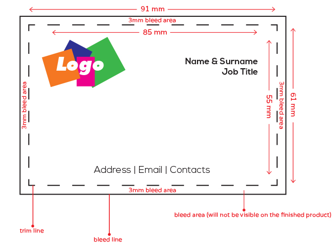
Your design file must include safe zones to prevent critical text or logos from being compromised during the final trim. We recommend keeping all vital information at least 5mm away from the edge of the document. For the most reliable results, export your work using the PDF/X-1a format, which is the preferred standard for commercial reproduction as it preserves transparency and embeds all necessary fonts. A 3mm bleed is the professional standard for posters because it provides a necessary margin of error during the mechanical trimming process, ensuring no white borders appear on the final cut.
Choosing the right paper weight, measured in Grams per Square Meter (GSM), depends entirely on the intended lifespan and location of your display. While 130gsm to 170gsm is suitable for short-term promotional flyers or high-volume distributions, premium posters typically require 250gsm or higher. Heavier stocks offer a more substantial feel and resist the curling often seen with lighter papers in humid or high-traffic areas. This technical choice directly impacts how your brand is perceived by clients and competitors alike.
This commitment to quality and longevity is a standard shared by all forms of visual craft. For those interested in how these principles of preservation extend to other mediums like permanent body art, you can learn more about Krets Tattoo and their approach to maintaining artistic integrity over time.
Choosing the Right Material Finish
Lamination and surface finishes provide both protection and aesthetic refinement to your elements for posters. Each finish serves a specific functional purpose in a professional setting:
- Gloss: This finish enhances colour saturation and deepens blacks, making it the superior choice for high-contrast, colourful retail graphics that need to pop.
- Matt: By eliminating glare and reflections, matt finishes are ideal for informational posters or legal documents displayed under heavy indoor lighting or near windows.
- Satin: Often considered the professional “middle ground,” satin offers a sophisticated low-sheen look that suits corporate lobbies and executive presentations.
For high-stakes presentations or retail environments where durability is paramount, professional mounting is the most effective solution. Utilizing foam board printing London ensures your posters remain perfectly flat and rigid, providing a polished, architectural quality that standard paper cannot achieve. If you are operating under a tight deadline and need technical guidance on material selection, you can contact our team for immediate assistance with your print specifications.
Industry Examples: Applying Elements for Maximum Impact
Applying the correct elements for posters requires an understanding of your specific industry’s communication standards. While the technical foundations remain constant, the strategic emphasis shifts depending on whether you are driving retail footfall or presenting complex architectural data. In high-stakes environments, the ability to adapt these principles ensures your message isn’t just seen, but acted upon. Successful implementation turns a standard print into a high-performing business tool that meets the logistical demands of modern commerce.
Retail Engagement Strategy
Retailers in Central London face intense competition for consumer attention. A boutique recently demonstrated the effectiveness of A0 posters by using high-saturation imagery and bold, urgent calls to action to drive immediate footfall. By placing these large-format prints at eye level, they successfully cut through the city’s visual noise. To create a cohesive brand experience, they integrated their interior posters with vinyl window graphics, ensuring a unified aesthetic from the street to the changing room. This multi-layered approach uses high-contrast elements to capture interest within the first three seconds of a passerby’s glance.
Event posters require a more rigid adherence to information hierarchy. The primary element must be the event name, followed immediately by a clear date, time, and location. In these instances, the use of white space is critical to prevent the layout from becoming cluttered. Professional event organizers often use different font weights to separate the “headline” information from secondary details like ticket prices or sponsor logos, ensuring the viewer can digest the essential facts at a distance.
The High-Stakes Corporate Poster
Corporate and technical presentations demand a level of precision that mirrors the standards of Booklets and Brochures. For legal and architectural firms, a poster is often a critical piece of evidence or a primary project proposal. These displays must balance dense information with clear shapes and lines to maintain professional decorum. Utilizing specialized CAD plotting services London is essential for these sectors, as it ensures that intricate technical diagrams and fine-line architectural drawings are reproduced with absolute accuracy.
In the fast-paced London business environment, the final and perhaps most important element for posters is the speed of production. When a deadline is looming for a court case or a major retail launch, same-day turnaround becomes a vital part of the project’s success. Choosing a technical partner that understands this urgency allows you to focus on the design and strategic elements, knowing the physical production is handled with methodical thoroughness.
Elevate Your Professional Presence in 2026
Creating a high-impact display requires a meticulous balance of creative strategy and technical production. By mastering the core visual and structural elements for posters, you ensure your message resonates in London’s most competitive retail and corporate environments. Whether you are implementing the latest color trends or refining your file’s bleed and safety zones, these professional standards protect your marketing budget and guarantee a polished result. Success in large-format printing is found in the details that translate your digital vision into a tangible, high-resolution asset.
We are here to act as your indispensable partner in this process. Our service includes expert file checking with every order to prevent technical errors before they reach the press. We provide premium 200gsm+ paper stocks as standard, ensuring your work has the weight and durability it deserves. If you are operating under a high-stakes deadline, our same-day turnaround for Central London projects provides the reliable support you need to meet your goals with confidence. Order Your Professional Large Format Posters Today and let us help you stand out with precision.
Frequently Asked Questions
What are the 7 most important elements for posters?
The most critical components include high-impact typography, strategic color contrast, clear visual hierarchy, and the effective use of white space. You must also prioritize high-resolution imagery, a direct call to action, and precise technical specifications like bleed. These core elements for posters ensure that your marketing assets are both visually compelling and technically viable for professional large-format production in competitive environments.
How much bleed do I need for a professional poster design?
You should include a minimum of 3mm bleed on all sides of your document to ensure a clean finish. This extra margin allows your design to extend beyond the final trim line, which prevents unsightly white borders if the mechanical cutting process shifts slightly. It is a standard requirement for professional commercial printing and should be configured at the beginning of your design phase.
What is the best font size for a poster to be readable from 5 meters?
Your primary headline should be at least 72 points, though 100 points or larger is preferable for maximum clarity at a 5-meter distance. While readability depends on the specific typeface and contrast, a general rule is to provide 25mm of height for every 10 meters of viewing distance. This ensures your message remains legible to passersby in busy retail or corporate corridors.
Can I use photos from my phone for an A0 poster?
You can use phone photos if they were captured at high resolution and aren’t heavily compressed, but they often fall short of the 300 DPI required for A0 clarity. Most modern smartphones capture images suitable for A2 or A1 sizes. For A0 posters, we recommend a professional file check to ensure the image won’t appear pixelated or soft when scaled up to large-format dimensions.
What is the difference between RGB and CMYK elements in poster design?
RGB is a light-based color model used for digital screens, while CMYK uses physical inks for commercial printing. Converting your digital elements for posters to CMYK is essential to ensure the colors you see on your monitor match the final printed product accurately. For businesses that need to maintain this color precision across all their printed assets, OptiMediaLabs Canada provides the professional color label printers and finishing equipment required for high-quality, in-house production. Failing to make this conversion often results in unexpected color shifts, typically making vibrant screen colors appear duller on paper.
How do I include a QR code on my poster without ruining the design?
You should place the QR code in a lower corner or within a dedicated action block to maintain your established visual hierarchy. Ensure there is sufficient white space around the code to keep it scannable and visually distinct from other graphic components. Using a high-contrast black code on a white background ensures functionality while allowing the rest of your design to remain the primary focus.
Which paper weight (GSM) should I choose for a professional look?
A paper weight of 200gsm to 250gsm is the standard choice for professional corporate posters. This thickness provides a premium feel and prevents the paper from wrinkling or curling under indoor lighting. For high-end presentations or permanent retail displays, mounting your print onto foam board offers even greater rigidity and a polished, architectural finish that withstands the rigors of a busy environment.
What is the best file format to send to a London printing service?
The PDF/X-1a format is the industry standard for sending print-ready files because it embeds all fonts and preserves transparency settings. This format minimizes the risk of technical errors during the production process. Always ensure your PDF includes crop marks and the required 3mm bleed to facilitate a precise final trim in a high-speed, deadline-oriented production environment.